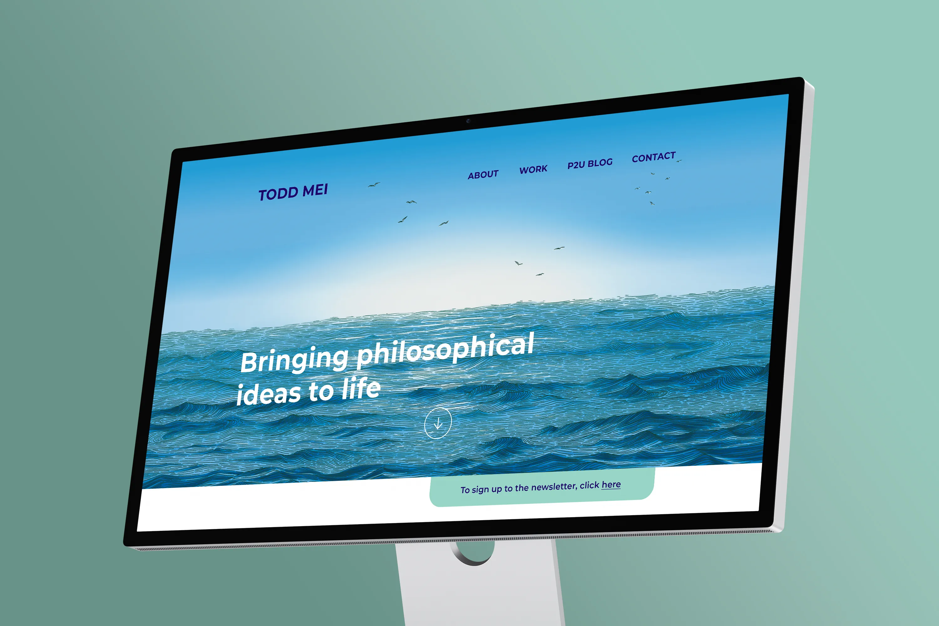
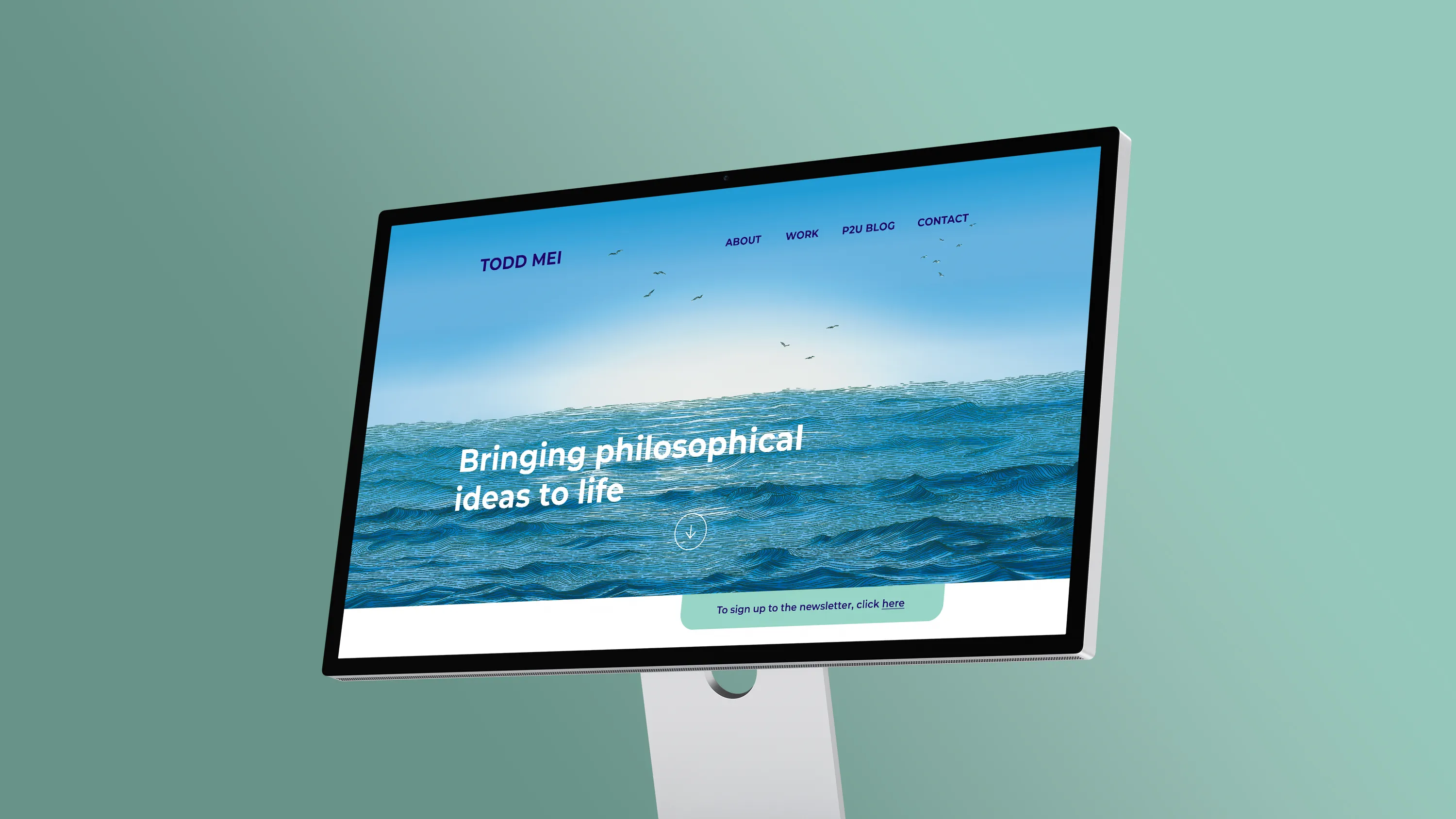
Homepage illustration for Todd Mei, a philosopher, writer, and researcher who brings philosophical thinking into business and technology.
Todd came to us for a personalised landing page illustration. The brief leaned toward nature, and the ocean especially.
We started exactly there, exploring how sea-related themes could create a distinctive, welcoming introduction to the site.
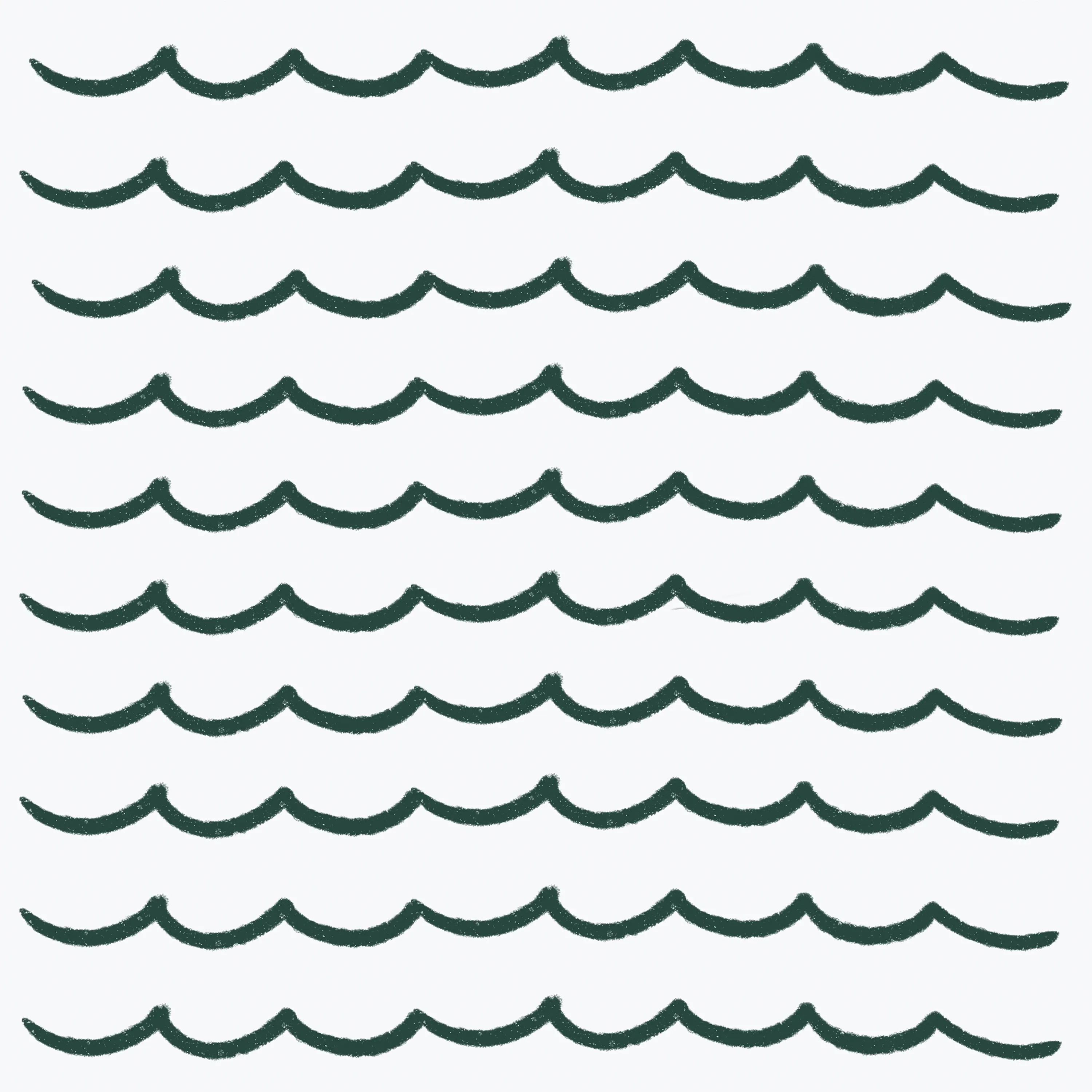
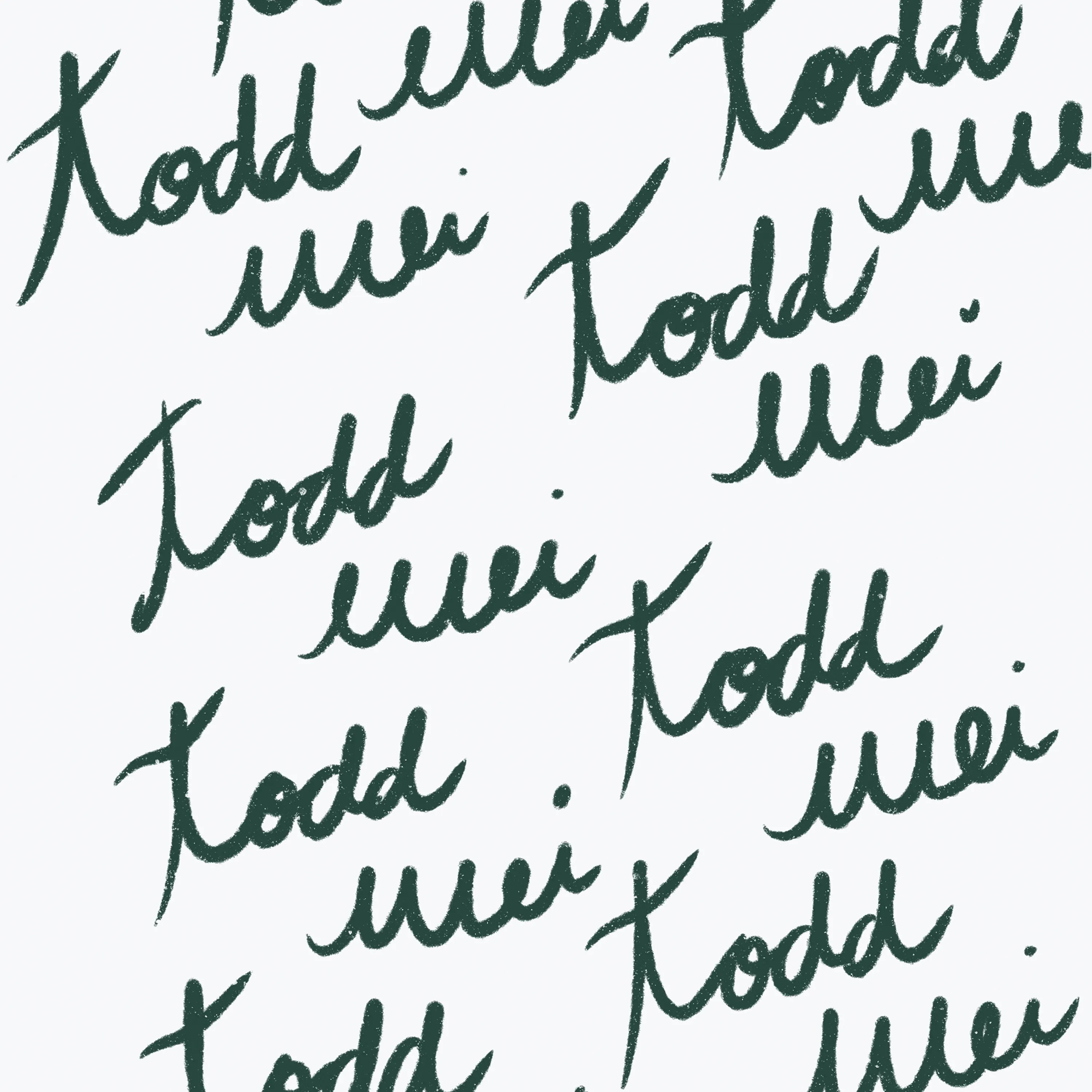
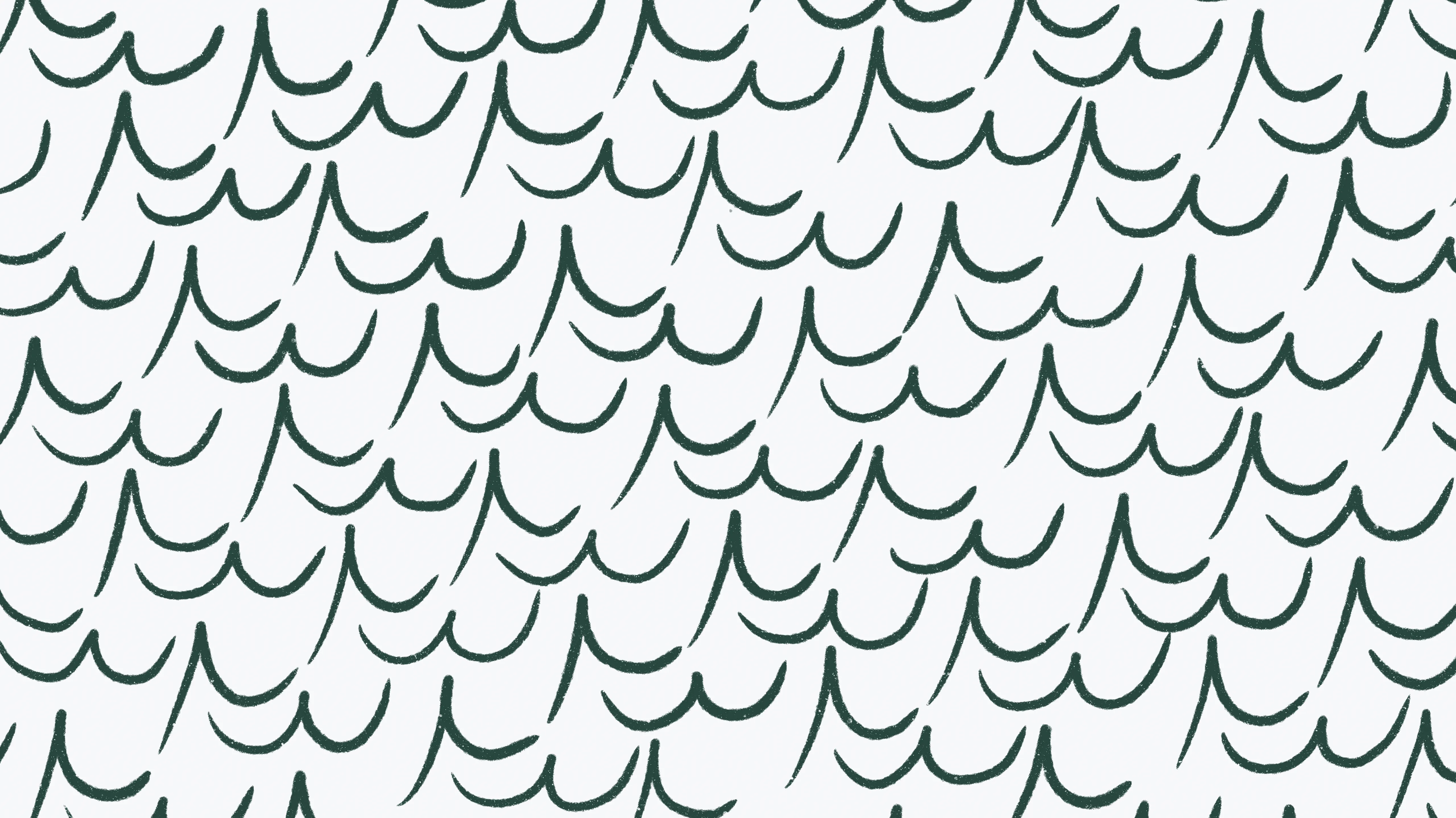
Using the pointed shapes in the letters of Todd's name, the T and M, we explored a repeating pattern echoing the sea's crests. The shape carried its own idea too, crests that come and go, ideas in motion, fitting for Todd's professional background.
But a pattern or mark felt too contained for the page. The site carries the full range of Todd's work, and it called for an opening just as wide.
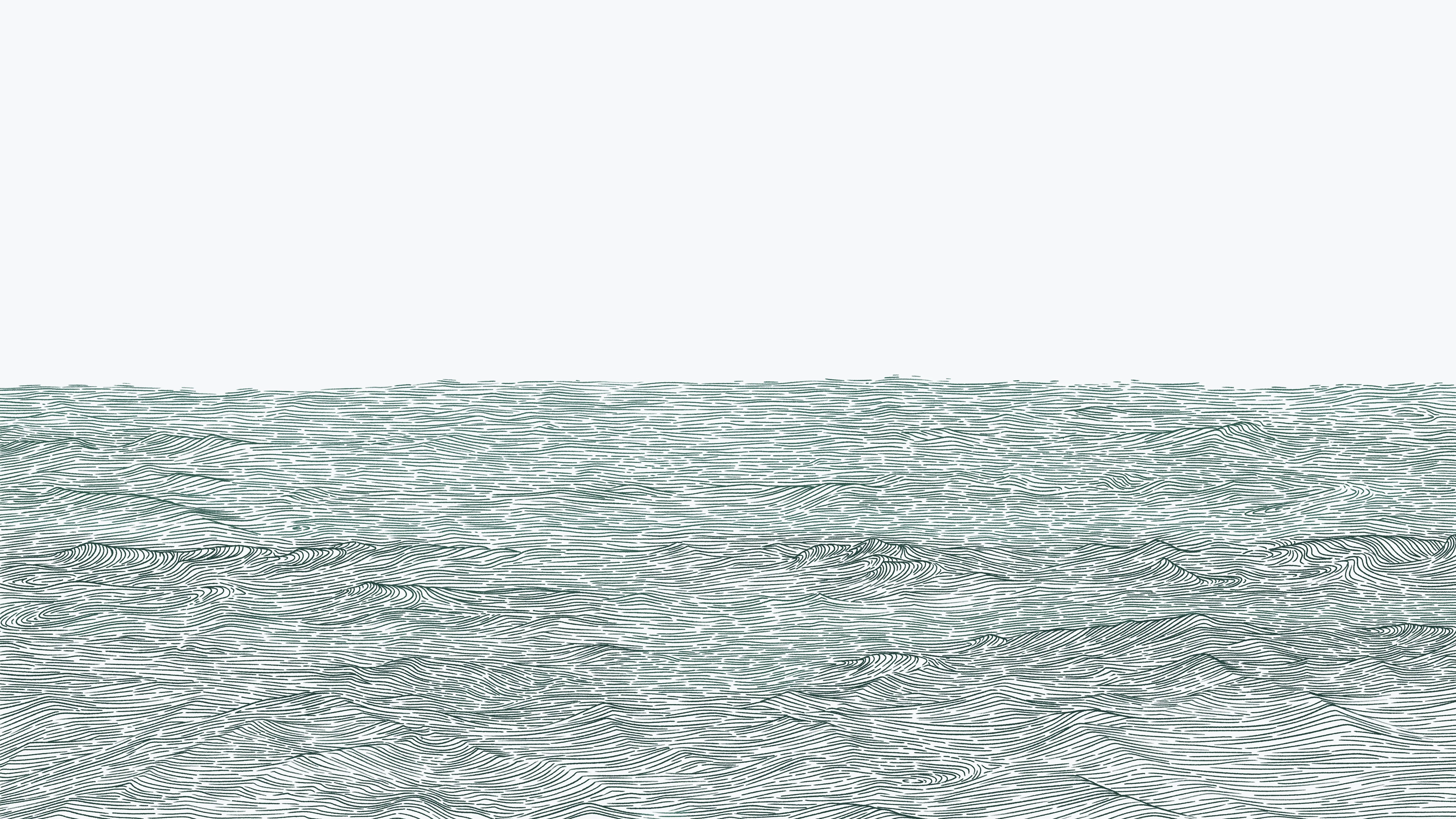
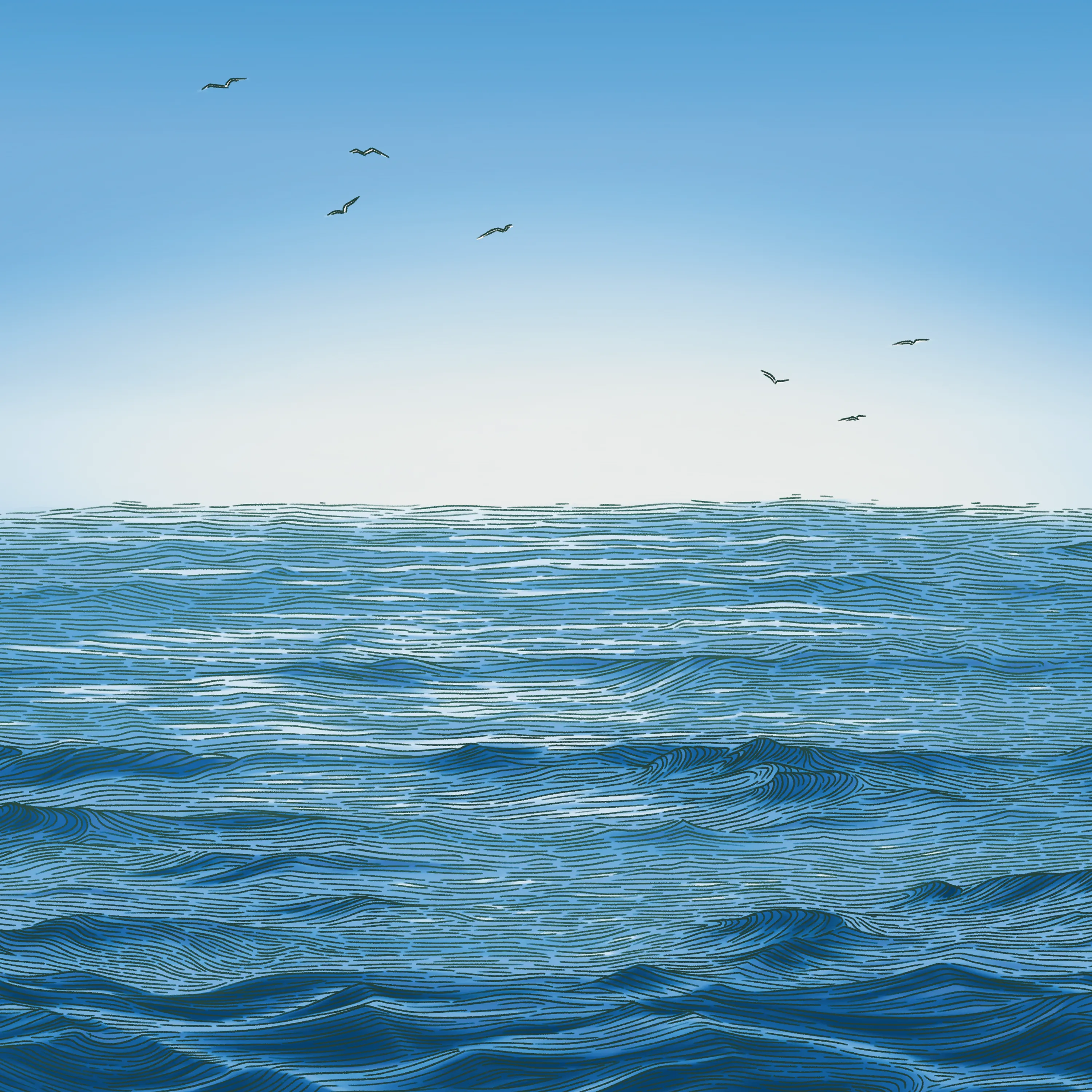
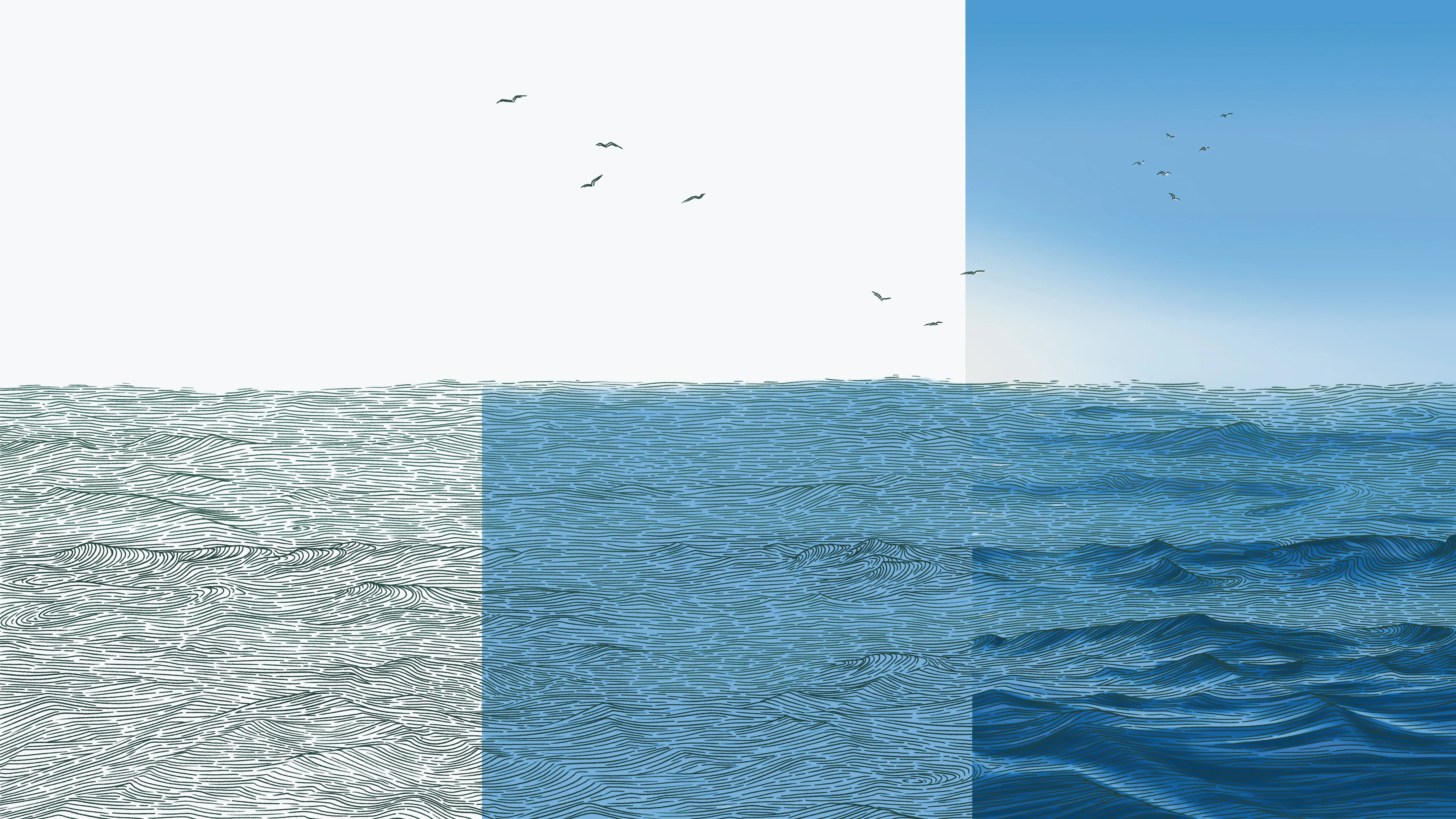
The final piece was drawn manually with a stylus pen and screen, built from close study of real ocean photography. Countless individual strokes form the wave pattern across the surface.
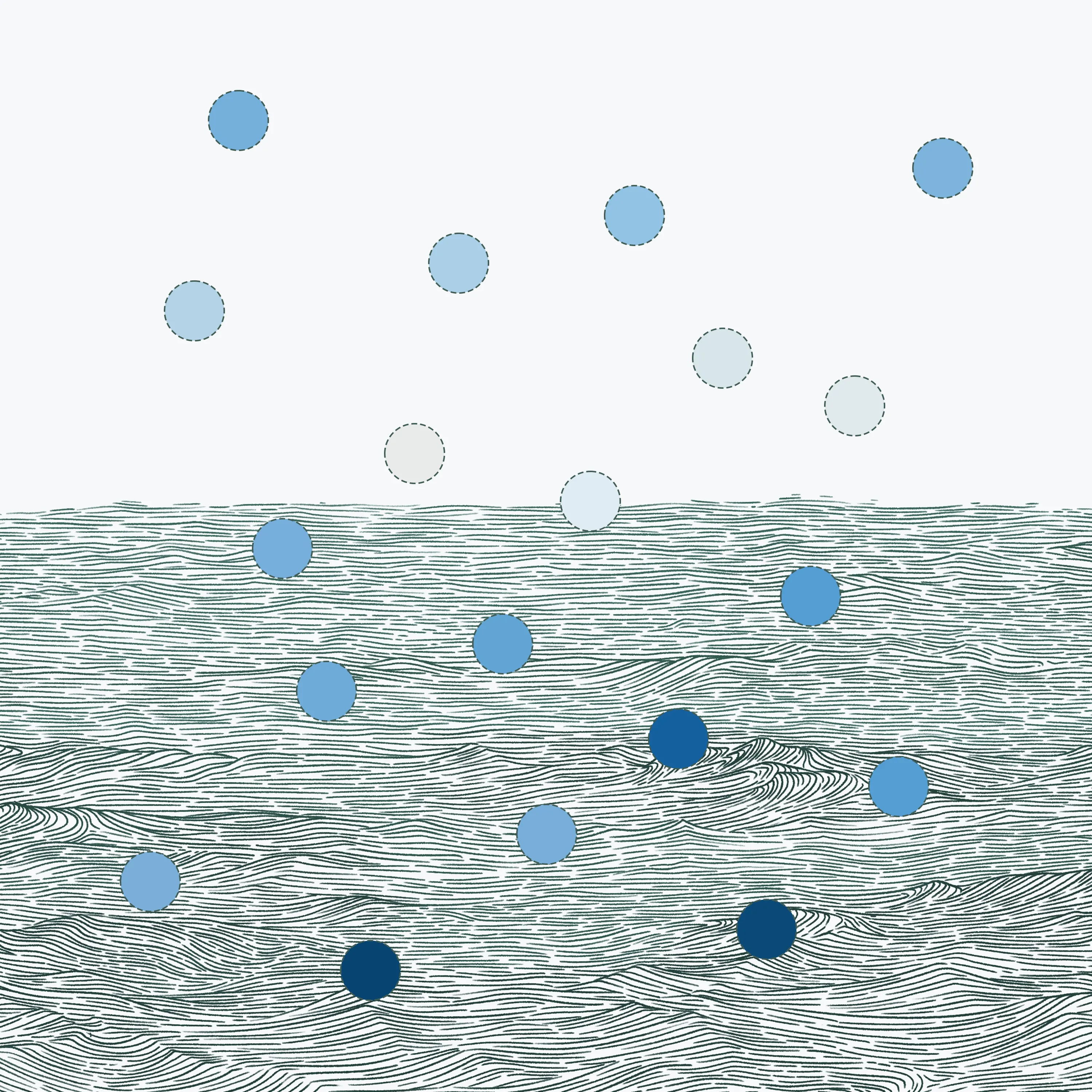
The palette runs through shades of blue, from deep, near-black tones in the foreground to lighter, cooler blues toward the horizon. A scatter of birds crosses the sky, small against the scene, giving the body of water its true scale.